The Metro (Middle Market Tabloid)
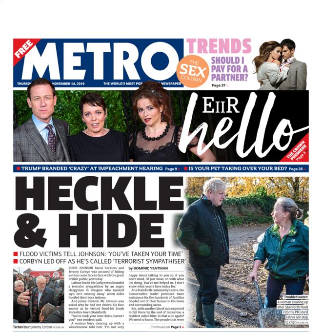
The Metro's language is more formal than the language commonly used in Tabloid's such as The Sun. It still makes puns and jokes for the title's on the front covers and uses the occasional informal language.
The most recent Metro front cover includes a mix of both hard news and soft news. It is talking about the new season of a series called 'The Crown' and some more intimate news as its soft news and as its hard news, it talks about the British politics and how Boris Johnson visits up north after the floods.
The typography used in The Metro's header is a sans serif text as it does not have any swirly lines, it is predominately straight.
Most of the header's for the articles are capitalised. It appears to be all hard news that is and the soft news has its own typography and colour to suit the style of what they are talking about in this article of soft news.
The front page of the Metro is dominated by photos and very large, bold headlines. There is a minimal amount of text on these pages as the headline and photos are made bigger to emphasise the importance of the headline they are associated with.
In their news, there is a mix of important news and news there to provide readers with entertainment. Some stories include British politics, mainly brexit, as their important news and the rest is for entertainment and tends to be individual people and some accomplishments or news that has happened with them through the week.
This type of newspaper also appeals to a mid market audience. These are people who aren't really concerned about the main stories but still want to keep up but also want some random stories to laugh at. These tend to be B and C1 audiences.

The Daily Telegraph (Broadsheet)
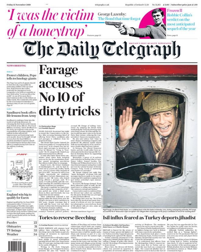
The language used in a broadsheet such as The Daily Telegraph is a lot more formal than that used in a tabloid or mid market tabloid. It focuses primarily or hard news and goes more in depth into it so they use the formal tone to appeal to the higher class people and smarter people who would want to read it.
The typography used in The Daily Telegraph is serif. This appeals to their audience better as it's more fancy and old fashioned.
This front page is dominated by copy. The images are a lot smaller than the ones used on tabloids or mid markets and there is a lot more text used. This is because they go more in depth into the hard news and key points than the tabloids or mid markets.
The news they offer in a broadsheet is information and main headlines. They don't give anything for entertainment like Tabloids do, they focus primarily on main headlines.
All this is done to appeal to an upmarket audience like B's and A's.

The Sun (Tabloid)
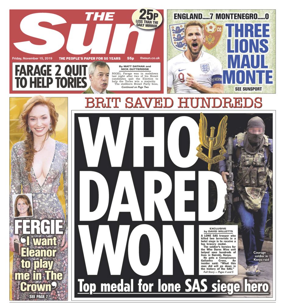
The language used in these headlines are a lot more informal than broadsheet's. They tend to make puns with their headlines and sometimes don't use proper English to create a joke.
The vast majority of tabloid news is soft news. They barely include hard news as it doesn't appeal to the audience they are creating for themselves.
Their title font is always sans serif. This take the fanciness out of the newspaper and shows what type of newspaper they are. It also again, helps them appeal to their chosen audience.
The front page of red top tabloids are always dominated by pictures and big headlines to use up space. They always have very minimal writing and nothing compared to that of a broadsheet.
The news on offer in a red top tabloid is there for entertainment as it uses a lot of soft news and puns for these headlines. Compared to a broadsheet who present their news as information to their audience.
Finally, these red top tabloids aim at a downmarket audience such as D, E and F as they will be less educated and the language used in a red top tabloid will suit their intelligence more.
No comments:
Post a Comment