Tuesday, 3 December 2019
Friday, 22 November 2019
Sound and editing task - Ghost Ship
Sounds
Music
Contrapuntal/parallel
Diagetic/non-diagtic
Onscreen/offscreen
Volume
Emotion
Dialogue
Editing
Special effects
Transitions
Order of narrative
Pace
Screen time
The music differs between contrapuntal and parallel within this opening scene. It is a very relaxed and peaceful tune created to add a mood in the main hall of the ship and on the deck for people to dance to. The singer who sings the song is given a lot of screen time to show to the audience that this isn't the only time we will see her within the film. Her song is diagetic
Monday, 18 November 2019
Thursday, 14 November 2019
Conventions in news
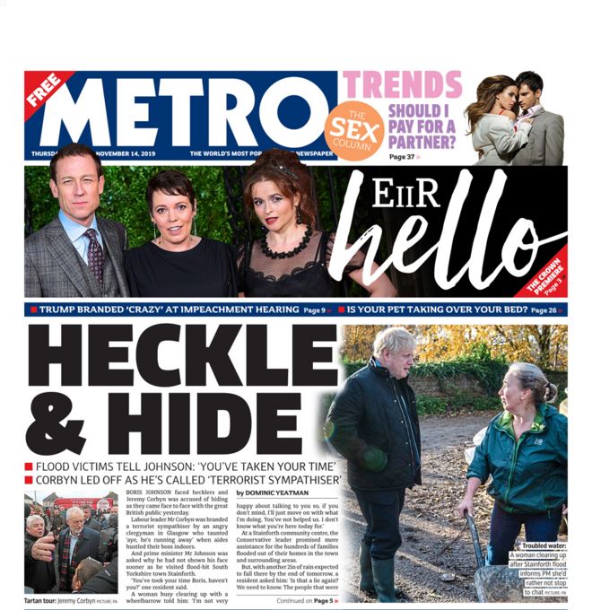
The Metro (Middle Market Tabloid)
The Metro's language is more formal than the language commonly used in Tabloid's such as The Sun. It still makes puns and jokes for the title's on the front covers and uses the occasional informal language.
The most recent Metro front cover includes a mix of both hard news and soft news. It is talking about the new season of a series called 'The Crown' and some more intimate news as its soft news and as its hard news, it talks about the British politics and how Boris Johnson visits up north after the floods.
The typography used in The Metro's header is a sans serif text as it does not have any swirly lines, it is predominately straight.
Most of the header's for the articles are capitalised. It appears to be all hard news that is and the soft news has its own typography and colour to suit the style of what they are talking about in this article of soft news.
The front page of the Metro is dominated by photos and very large, bold headlines. There is a minimal amount of text on these pages as the headline and photos are made bigger to emphasise the importance of the headline they are associated with.
In their news, there is a mix of important news and news there to provide readers with entertainment. Some stories include British politics, mainly brexit, as their important news and the rest is for entertainment and tends to be individual people and some accomplishments or news that has happened with them through the week.
This type of newspaper also appeals to a mid market audience. These are people who aren't really concerned about the main stories but still want to keep up but also want some random stories to laugh at. These tend to be B and C1 audiences.
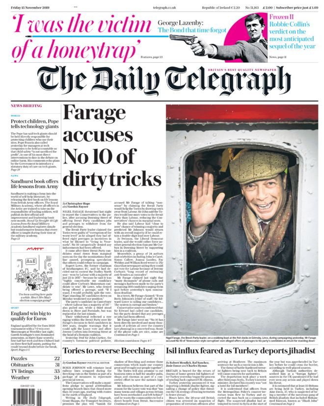
The Daily Telegraph (Broadsheet)
The language used in a broadsheet such as The Daily Telegraph is a lot more formal than that used in a tabloid or mid market tabloid. It focuses primarily or hard news and goes more in depth into it so they use the formal tone to appeal to the higher class people and smarter people who would want to read it.
The typography used in The Daily Telegraph is serif. This appeals to their audience better as it's more fancy and old fashioned.
This front page is dominated by copy. The images are a lot smaller than the ones used on tabloids or mid markets and there is a lot more text used. This is because they go more in depth into the hard news and key points than the tabloids or mid markets.
The news they offer in a broadsheet is information and main headlines. They don't give anything for entertainment like Tabloids do, they focus primarily on main headlines.
All this is done to appeal to an upmarket audience like B's and A's.
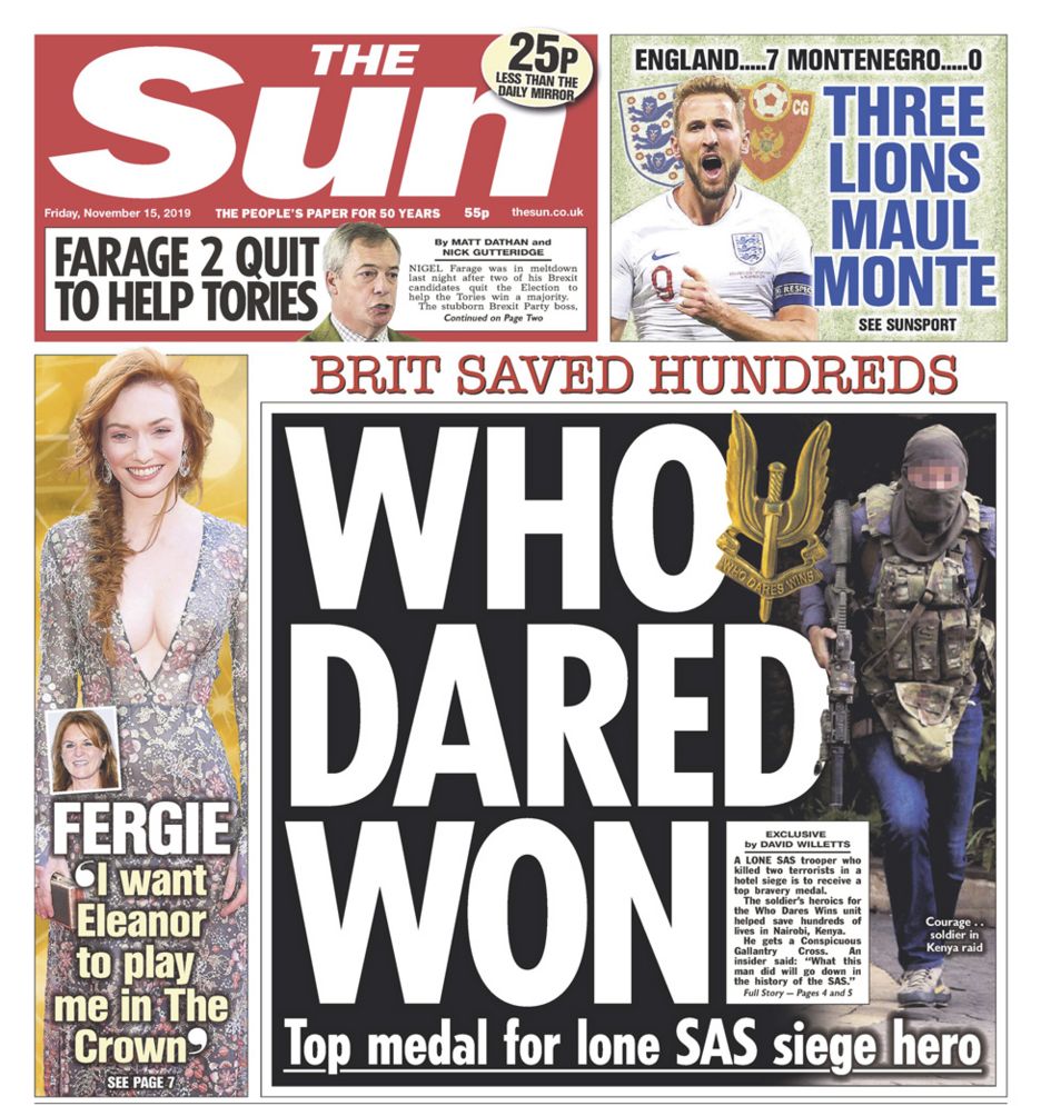
The Sun (Tabloid)
The language used in these headlines are a lot more informal than broadsheet's. They tend to make puns with their headlines and sometimes don't use proper English to create a joke.
The vast majority of tabloid news is soft news. They barely include hard news as it doesn't appeal to the audience they are creating for themselves.
Their title font is always sans serif. This take the fanciness out of the newspaper and shows what type of newspaper they are. It also again, helps them appeal to their chosen audience.
The front page of red top tabloids are always dominated by pictures and big headlines to use up space. They always have very minimal writing and nothing compared to that of a broadsheet.
The news on offer in a red top tabloid is there for entertainment as it uses a lot of soft news and puns for these headlines. Compared to a broadsheet who present their news as information to their audience.
Finally, these red top tabloids aim at a downmarket audience such as D, E and F as they will be less educated and the language used in a red top tabloid will suit their intelligence more.
Friday, 8 November 2019
Newspaper homework - analyse a front cover

The Sun's intended audience for this would've been B to C2 because it isn't a broadsheet that provides lots of information but it does give you the key details. It also has many jokes within titles as you can see here whereas newspapers such as The Guardian focus more on getting the information to the reader and not on making jokes and filling the pages with pictures.
In the title 'Floppy Johnson can't get an election' it is an obvious pun used with Boris Johnson's surname which can also be quite rude. This can take some of the seriousness off of the situation and the tone will a lot less serious just how The Sun would want it for their intended audience. Also, if the ruder situation of this happened in real life then it wouldn't be a good situation which can also let the audience know that it isn't just to be joked about.
The article topic is the fact that the Prime Minister cannot get an election and therefore the 'no deal' Brexit gets blocked. This article may not be suitable for younger people as they might not understand politics and therefore they won't understand the article.
An image used next to this title is a picture of Boris Johnson looking directly down and looking upset and annoyed.


Tuesday, 5 November 2019
Thursday, 24 October 2019
Tuesday, 15 October 2019
Theories for assessments
Stuart Hall - Reception Theory
A man named Stuart Hall came up with the idea that communication is a process involving encoding by producers and decoding by audiences and the idea that there are three hypothetical positions from which messages and meanings may be decoded:

A man named Albert Bandura came up with the idea that media can implant ideas in the mind directly and that audiences acquire attitudes, emotional responses and new styles of conduct through modelling. He also had an idea that media representations of transgressive behavior, such as violence or physical aggression, can lead audience members to imitate those forms of behaviors.
George Gerbner - Cultivation theory
A man named Stuart Hall came up with the idea that communication is a process involving encoding by producers and decoding by audiences and the idea that there are three hypothetical positions from which messages and meanings may be decoded:
- The dominant-hegemonic position: the encoders intended meaning is fully understood and accepted.
- The negotiated position: the legitimacy of the encoders message is acknowledged in general terms, although the message is adapted or negotiated to better fit the decoders own individual experiences or context.
- The oppositional postition: the encoders message is understood, but the decoder disagrees with it, reading it in a contrary or oppositional way.
Albert Bandura's - Media Effects Theory
A man named Albert Bandura came up with the idea that media can implant ideas in the mind directly and that audiences acquire attitudes, emotional responses and new styles of conduct through modelling. He also had an idea that media representations of transgressive behavior, such as violence or physical aggression, can lead audience members to imitate those forms of behaviors.
George Gerbner - Cultivation theory
Thursday, 10 October 2019
Thursday, 3 October 2019
Three countertypes

This is a countertype against old people because old people are thought to be frail and can't move easily but this person is very fit and using the gym.

This is a countertype for overweight people because people imagine them to be eating loads of food but this person is doing something about it by running and working it off.

This is a countertype against rugby players. People imagine rugby players as huge and muscly but this guy is very small but still playing.
Friday, 27 September 2019
Boyz n da hood analysis - Homework
At the start of the film, they introduce it with real life facts on the screen but with an action scene happening in the background. We cannot see this scene but we can hear it entirely as it unfolds and it's clear it matches with the facts. This has been done by the producer so the audience get a true feeling of what is happening behind and to show how powerful just sound can be. We don't even need a picture to understand that there has been a shooting between two gangs or enemies which makes it so much more powerful for the reader because we can hear their minimal planning, showing how quickly and easily it can happen. It may also add to how gruesome and scary these scenes in real life can be by not showing the images, just the sound.
The first scene with images is a stop sign shown after the audio of a harsh shooting in which police attend. This quick zoom shot of a red stop sign is a very powerful opening image to the movie, especially after the awful scene before. It is used to created an impression to the viewers to stop the horrific gang violence going on around the world and stop the actions happening within the rest of the movie.
When the children first go behind the police tape the producer uses many quick jump shot transitions when showing what is behind the tape. This is to give a large, meaningful scene a quicker overview and everyone can capture every smaller detail within the shot rather than using a big wide shot where there audience might miss a key detail within the scene.
The first scene we get of the school and the kids within the school is crucial to understanding the personality and perseverance of the kids in the neighbourhood. It starts with quick jump cuts of the class work and the drawings the kids have done before panning across the classroom and all the kids. The panoramic shot from right to left of the classroom is key to understanding what the children's mentality towards school is like. All of the kids are either dazing and looking around or sleeping. None of the kids are focused on the teacher who is talking and teaching them which shows to us how unmotivated the kids in this 'hood' are towards school work.
Premiere practise
For this task, we were learning to use Premiere for the first time. We had footage and audio given to us for us to edit together for the first time. I learned to use transitions, such as the fade and dissolve transitions, and how to fade out audio.
Monday, 23 September 2019
Wednesday, 11 September 2019
Semiotics
Class notes
Semiotics
Semiotics means the study of signs. It is when you use images to represent things and use something that stands for something else. For example, the semiotics for the settings on an iPhone are cogs which is used because cogs are things that turn and make things work and move, just like all your settings within the application.
Denotation
Denotation is what we see when we look at an image and nothing more.
Connotation
Connotation is what we understand from the image - connotations given.

For example, for this picture the denotation is a lion with a sunset behind him. The connotations of this could be that the lion standing proud represents pride and power.
Connotations
Yellow - happiness, peace, calming, cowardly, hazards, hope
Stuart Hall's theory - 'polysemia'
Polysemia - many reading
Stuart Hall's theory was that audiences can have different reactions to a media text, whether it be in a film, documentary, newspaper or even an image.
Preferred reading
Preferred reading is the reading you want the audience to get from your image/advert or how you want it to be viewed.
Oppositional reading
Oppositional reading is where the intended meaning from your image/advert is opposed by the audience. The wrong meaning is given to the audience to the one you intended to give.

Homework

A denotation from this film poster would be a difference in the light. On the right hand side it is bright blue from the lightsaber being held but on the left hand side it is red through Kylo Ren's infamous weapon. The connotation from this is that the good characters within the movie are on the right hand side with a blue highlight surrounding them and the bad characters are on the left side with a red highlight, clearly showing that there are two sides in the movie and it shows which characters are part of which side. However, another denotation is Rey in the center of the screen. She is a bigger sized character than most of the others giving the connotation that she has more importance within the movie than the smaller characters. This links into the later connotation about the light because she is centralised and not placed in front of either light sources. This connotes that she maybe flicks between sides in the movie, acts like she is on one side for intel or betrays one of the sides.
Another denotation is the planet in the background on the right hand side of the poster. Two interesting things about its denotation is the side of the poster its on and its size. The side its on produces the connotation that it could be a hideaway for the good side through the movie at some point which gives another connotation that the bad side are on top for a part of the movie.
The size is also interesting because Kylo Ren, who appears to be the main villian, is bigger than the planet. This again produces a few connotations that maybe Kylo Ren owned the planet before or takes it over very easily in the movie.
Finally, the ships at the bottom are coming out of an explosion. This denotation comes with the connotation that they are used in the movie for an outer space fight. This would've been done to show the audience that not all the fight scenes in the movie take place with ligthsabers and on ground. It gives the movie a variety of settings to keep the audience interested.
Genre - photos
Family film


These photos show a family film because my characters my characters are all laughing and smiling and having fun together. There are a mixture of actions such as dancing, interacting, talking and caring for each other. The props used are brightly coloured and would be interesting and funny to appeal to a younger audience and the dancing and choreography would appeal to an older audience.
To improve this I would have more people appear in my photos and i would use a better background as a school playground can be quite boring.
Thriller film


These photos all show a thriller because there is an element showing that something thrilling is happening in the movie. In the first and last photo we used props to allow the audience to interpret the thrilling genre whereas in the second photo we used costumes to create a mysterious character which can create a thrilling feeling as this character will be sent on a journey.
To improve these photos I would change my camera angles to create more close ups on characters facial expressions and create a better image for the viewers.
Monday, 9 September 2019
Genre

S- Outside a well built house with minimal light. A single ray of light to highlight the character who is underneath a dim street lamp. The house looks like an upper-class house because the character is stood by a gate at the entrance of the house. Some plants are put outside the house showing that the characters who own the house are very pleased of their home.
T- The poster gives an ominous feel to the movie as only certain points are highlighted on the poster. It also has a mysterious feel as a silhouette of a person is used and you can't see them. This keeps the viewer guessing as they don't know how they are related to the movie.
I - The dim lamp is there to add to the terrifying feel as it shows how ineffective it is in the light and how the dark light overpowers the scene.
Sunday, 8 September 2019
Summer Tasks


The
big 6 are the six biggest companies that own almost of the media we see today.
These big sixes are: Disney, 20th
century Fox, Paramount, Sony, Warner Bros and Universal. This is now being
considered as the big 5 because Disney have just bought 20th century Fox.
Within
the big six they all own their own companies; Disney won Lucasfilm, Waltdisney and
ESPN, Sony own Columbia Pictures, Warnerbros owns Turner, HBO and Notable Equity
Investments and universal own NBC, Illumination and Focus.
•Disney produced a live action remake of
Lion King this year which so far has a gross profit of $1.599 billion
(£1,300,826,475). It also had a budget of $250-260 million
(£203,381,250-£211,516,500) which was used to hire the likes of
Beyoncé, Seth Rogan and Donald Glover. It was released on July 9th 2019 in Hollywood but July 19th worldwide.
•20th
Century Fox released Dark Phoenix on June 4th in
Chinese Theatres but June 7th
worldwide. They had a $200 million (£162,647,000) budget and made $252.4
million (£205,260,514) from the movie. The movie also starred James McAvoy,
Michael Fassbender and
Jennifer Lawrence.
•Paramount will be releasing a new
Terminator this year on November 1st
2019. The budget for this movie is $160million-$200million (£130,120,800-£162,647,000).
It is based on characters made by James Cameron and is very famous for starring
Arnold Schwarzenegger who also has made some very famous lines while filming
previous Terminators.
•Sony released the Angry Birds 2 movie
this year on August 16th which had a lower budget of $65million
(£52,884,975) and made $104.3 million (£84,818,846). It starred the likes of
famous actor Peter Dinklage, Josh Gad and Leslie Jones.
•Warnerbros released Godzilla: King of Monsters on
May 31st which had a grossing profit of
$385.9million (£313,636,366)
and had a running time of 132 minutes. It also included the likes of Kyle
Chandler, Millie Bobby Brown and Thomas Middleditch.
•Universal released Happy Death Day 2U on
February 13th with a low budget of $9million (£7,307,325)
and made $65million (£52,775,125). It had a running time of 100 minutes and
starred Jessica Rothe and
Steve Zissis.
Friday, 6 September 2019
Mood Board
Favourite of the nine forms of media
Internet:
Snapchat

Video Game:
Fifa 19
Music:
Pop Out - Polo G
Radio:
Capital FM
TV:
Peaky Blinders
Newspaper:
The Sun
Magazine:
Match Of The Day Magazine
Film:
Avatar
Advertising:
Cadbury's advert
Internet:
Snapchat
Video Game:
Fifa 19
Music:
Pop Out - Polo G
Radio:
Capital FM
TV:
Peaky Blinders
Newspaper:
The Sun
Magazine:
Match Of The Day Magazine
Film:
Avatar
Advertising:
Cadbury's advert
Youtube Video
Introduction to media - Use HTML to import a YouTube video ( JOKER - Final Trailer)
In this video, the camera uses many close-ups and distance shots of the main character. They do this so we can see the character in many different ways such as how he is in public compared to how he is alone. When alone he is seen in various close-ups so we focus on the character and his mental state but in public he is shown from more distance shots so that we can see his reaction to other people. They also use a number of different lighting styles depending on the characters mood or position he is in. For example, when he is alone the lighting darkens which adds to the sad mood the character is feeling after being alone but when he is out interacting with the public, the sun provides the scene with light which is used cleverly. He gradually smiles and as he does this the camera pans into a position where the sun can reflect over the character and brightens the mood for us and the character.
The industry that has created this movie and trailer is Warner Bros who's parent organization is Warner Media. They were founded on the 4th of April 1923 in Hollywood, Los Angles by Albert Warner.
This is aimed at an older audience as there are many dark scenes used in the movie and it shows someone depressed going mental and acting in a peculiar way. People who enjoy horror movies would enjoy this as it shows a character turning into something people can find terrifying and being very unpredictable, sometimes in a gruesome way.
This represents someone who is depressed or not getting treated correctly in a very bad way for the audience as they might not be mentally stable and can become very strange. It is also shown as very disruptive and bossy towards people lives when they get their way and the attention they wanted.
Subscribe to:
Comments (Atom)